Your digital fundraising growth is directly tied to the effectiveness of your donation page. Many nonprofit programs fail to look at the intricacies of e-commerce and user experience that result in visitors abandoning your form instead of completing a transaction.
In donation form optimization, the basics matter. We’ve curated a list of donation page best practices that will increase your conversion rate.
1) Place Organization’s Logo at the Top of the Form
Security is important in e-commerce. Reiterating your brand through placement of your logo can provide website visitors with continuity in their user experience. Putting your logo at the top of the form makes it look established and safe.
2) Implement an SSL
Speaking of security, make sure your donation form is secure using an SSL (Secure Sockets Layer) certificate. This can likely be obtained through your existing web tools, like your website CMS (like WordPress) or your Domain Name Manager. SSLs are used to establish an encrypted connection between a browser or device and a website. In other words, it helps make your donation page secure.
3) Include Engaging Imagery
Visual content marketing can reinforce your mission and reason to give. If you’re going to use images, make sure they are connected to what you do. (And test variable images to optimize!)
4) Reinforce Why with Minimal Copy
If someone clicks a Donate Now button, they’ve already shown a buying signal. Don’t overthink the copy you use — make it a strong, succinct reiteration of the reason to give.
5) Use 3-4 Gift Amounts Plus “Other” Field
Based on what you know about your current digital donors, offer three to four gift amount options for easier giving. We’d suggest always leaving a separate “other” field in the event their gift choice is not shown.
6) Clearly Note Required Fields
It’s annoying having to go back several times to figure out which field you didn’t fill out and eventually a prospect will leave altogether. Make marks next to required fields so they can easily put in their information, once. (This also applies to the proper way to handle errors, making it clear for your users where they may have made a mistake.)
7) Include Email Address Field
An email address serves several purposes, not only as a conversion tactic used to grow your database but also as a reassurance measure so the person can receive a receipt for their gift. Always include this field on your form.
8) Make Submit Button Large and Clear
This may seem like a no-brainer, but we can’t tell you how many forms we’ve come across that implement subtle submit buttons. Creating a clear and large submit button at the bottom of the form will lessen confusion.
9) Keep Branding Consistent with Your Guidelines
Brand consistency is important. Keeping the guidelines of your brand throughout the form (i.e., color scheme, graphics, etc.) makes the page seem valid and up-to-date.
10) Use Fewer Fields
Too many fields makes the process longer. The goal is efficiency, so work to establish a user experience that is quick and convenient as possible. The fewer number of fields, the better.
11) Always Display Thank-You Page
Display a thank-you page once the donation form has processed. This provides a post-sale customer service experience and ensures the gift was completed. Don’t forget to note that the gift was securely processed; details like this count towards good stewardship.
12) Make Form Mobile Responsive
If you’ve heard us say this before, doesn’t matter, you’ll hear it again. Make sure your form is mobile responsive. If it isn’t conducive to desktops, tablets and phones, you will leave donations on the table.
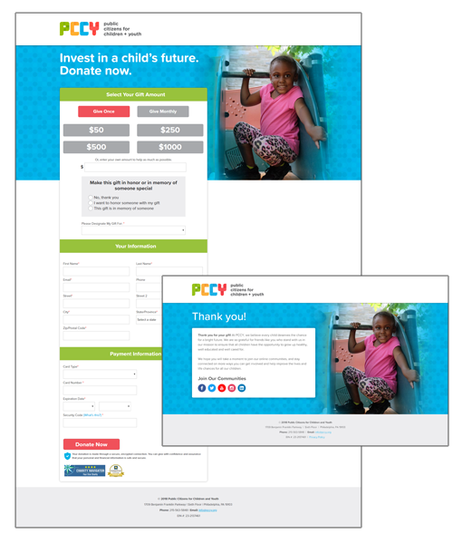
Some Examples We Like
Our client, Public Citizens for Children + Youth, sets the standard with a neat, vibrant donation form that hits all the points we’ve discussed:
The Proof is in the Pudding
Well, not pudding, but there’s definitely proof in our breakthroughs. Our client, South Plains Foodbank, wasn’t converting enough donors with their previous form. We performed A/B tests on three donation forms and found that these four elements triggered donor response:
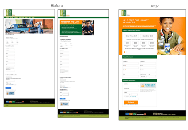
Within 30 days, South Plain’s redesigned form increased the conversion rate by 13%. After 60 days, the conversion rate increased by 44%..
If you haven’t implemented these factors yet, it’s time to go back in and do some work. These pointers will ensure that your fundraising process doesn’t drop the ball at the end, where it truly counts.
Oh, and one more thing: Almost all of these recommendations are testable (save for the SSL and thank-you page — you absolutely must do those).
Once you've mastered the basics, you can begin testing A versions and B versions to see where you get the best response.


Leave a comment: