Fundraising appeal emails, or eAppeals, are essential to any nonprofit’s digital program. One-third of online fundraising revenue comes from email, making effective eAppeals just as important as the design of your website.
The goal of an eAppeal is to compel your email list to take action. It’s important to create a central message with engaging creative as support. You not only want to grab people’s attention, but also turn clicks into donations.
The digital team at RKD Group has helped to raise millions of dollars with eAppeals and, after years of testing and reflection, we think we’ve nailed down the anatomy of the ideal email appeal.
1. Start at the Beginning
People get hundreds of emails a day, so what would make them want to open yours? Familiarity and a relevant and enticing subject line that relates directly to them is the best start to getting an open.
- Do: Subject Line: “We can only get there with your help, Sue”
- Don’t: Subject Line: “We need your help”
The key here is relevance. Meaning, your sender and subject line has to jump out of the inbox and grab their attention. And yes, this is a wonderful sandbox area for testing—but keep in mind the reality of the component.
Subject line and sender testing should give you insights in the moment, but are rarely transformative email marketing tests.
2. Think in Decisions
Every element of your eAppeal is a decision point for your reader.
The pre-header text, while short, gives a preview of what a person is about to read. People will use that to gage if your email is worth opening and reading further, so it needs to stand out. Does the pre-header text entice as much as the subject the line?
Each of these elements needs equal consideration. They are each decision points made in milliseconds that can be the difference in your email getting opened or thumb-swiped to the trash.
3. Intentional Imagery
Most organizations take one of two approaches to eAppeals.
There’s the camp with images, and the camp without. Whether or not to use imagery should be based on your resource, your testing and your strategy.
If you do use images, you need to keep in mind the intentionality of each component. Images play a massive role in feelings and the goal of eAppeals is to compel people by getting in-touch with their emotions. It’s important for your images to match the feelings you want portrayed in the message. If you present an issue of neglect, the images shouldn’t reflect health and happiness.
Don’t shoehorn in an image if you don’t need one. But if you do use one, remember that every part of your eAppeal must be emotional as with any fundraising effort.
4. Actionable Headline
If someone doesn’t have the time to read the entire email, can they get the gist of what you’re talking about from the headline?
Too many eAppeals miss the boat with a headline that doesn’t set the hook.
Perfecting this can help the reader make a quick decision to take action.
5. Clear, Concise & Scannable Message
An eAppeal’s body text should be scannable; meaning that if someone doesn’t have time to read word-for-word, they can still understand the story and why you’re writing them. You don’t want the reader to be confused, so keep the message short, consistent and clear. Attention spans are shrinking.
That means our marketing materials must work harder to cut through the noise that’s all around us.
A concise message with crisp writing and scannable text will help you win the battle for focus.
6. Clear Ask
Never forget the point of your communication.
Why are you writing? A donation? Volunteer sign-up? Urgent appeal? Advocacy?
Don’t be afraid to ask and be direct. Beating around the bush will cause reader confusion and negate the point of you reaching out in the first place. Also remember to create the sense of urgency.
- Do: Give Now Button or “Please give and help us…”
- Don’t: Place multiple callouts in the email and/or put give buttons in odd places
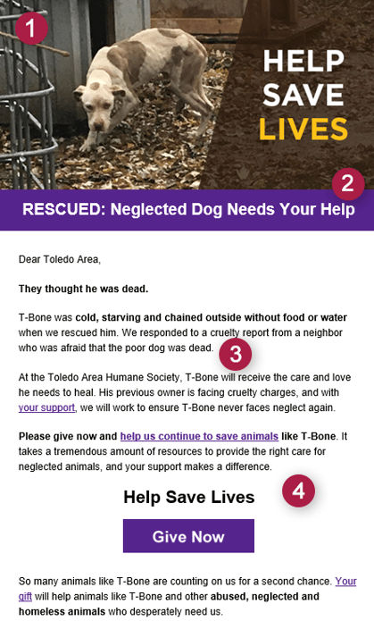
An example of a strong eAppeal was created by our RKD Group digital team for our client, Toledo Area Humane Society:

- The image matches the theme of neglected animals with a dog who looks scared and unhealthy.
- The headline engages the reader directly by including an alerting word like “RESCUED” and including “Your Help”, as if they are speaking to the individual.
- The main character/protagonist and the problem is immediately featured. You’re drawn in by the description but story was also short and simple.
- The ask is very clear and accessible with a “Give Now” button that links directly to the SPCA’s donation page. It isn’t redundant and stands out at the end of the story.
Keeping these pointers in mind will help you craft a compelling eAppeal that’s engaging and encourages your recipients to act.


Leave a comment: