Donation page design is both science and art. We’ve seen small design changes make big impacts. Colors, fonts and images influence conversion rates and gift size. And, lately, more technical items like payment options, error reductions and cover-the-fee checkboxes have helped bring in more revenue.
We have a blog, Current Donation Page Best Practices, that can tell you all about these important design elements. But, as helpful as a list of best practices is, we also know that examples are the best form of reference. While curating our list of best practices, we saw a ton of donation forms that showcase form, function or both—and have proven to be winners. Here are 12 of our favorite donation pages:
1. Mothers Against Drunk Driving
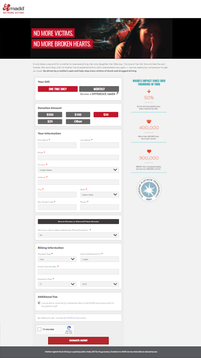
This donation form can be summed up in one word: Emotion. From the imagery to the headline to the descriptive copy below, donors get immediately drawn into an engaging experience.
We also love the monthly donation button featured here, and the form features a lightbox that pops up to encourage a monthly gift.
2. Coast Guard Foundation
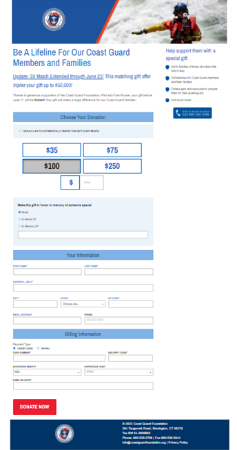
Do your donors know the impact of their donation? They might, but we think it’s always a good idea to remind them.
We like that this page design provides a space to reiterate the impact of a donation. The Coast Guard Foundation used this right-hand column to address all possible drivers for donation; country, education, children, family, etc.
Donate to The Coast Guard Foundation
3. North Texas Food Bank
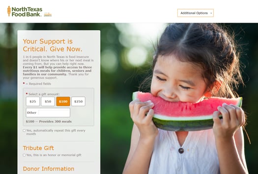
A design that meets brand standards is so important (#9 on our best practices blog by the way). If you’re using a design template, be sure to update default colors, fonts and images to match your branding. Send donors to a template that’s off-brand and they might second guess their donation.
This donation page is an excellent example of applying Feeding America brand standards. Feeding America has nationwide brand recognition and this page matches it perfectly. Green and orange are used throughout the design. The image of the child even has a green background and a green watermelon!
Donate to North Texas Food Bank
4. Los Angeles Mission
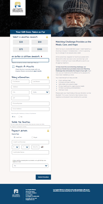
Want a great way to encourage donors to give? How about helping them find out if their employer will match their gift?
This donation page includes a plugin from Double the Donation that allows users to search their company name. Once the donation is submitted, an automated email will go out to the company requesting the matching gift.
5. Food For The Poor
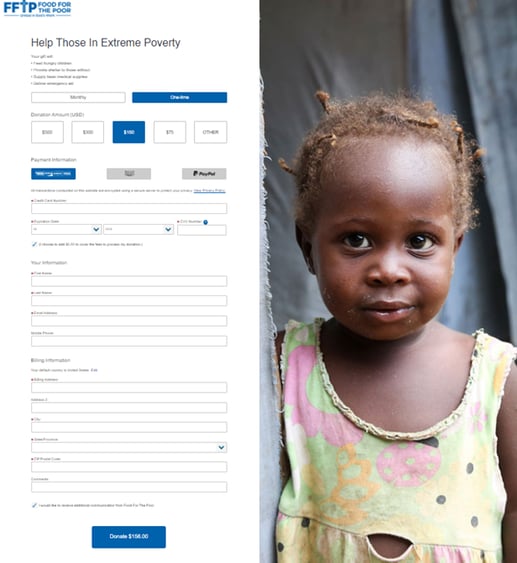
Another great tech trend for donation pages is adding “cover the fee” functionality that asks donors to help pay for credit card processing fees.
What makes Food For The Poor’s form unique is the way the full gift amount (including the cover-the-fee total) is included on the Donate Now button. This reduces donor confusion about their final gift amount, and it has led to a 14% increase in cover-the-fee participation.
6. Susan G. Komen
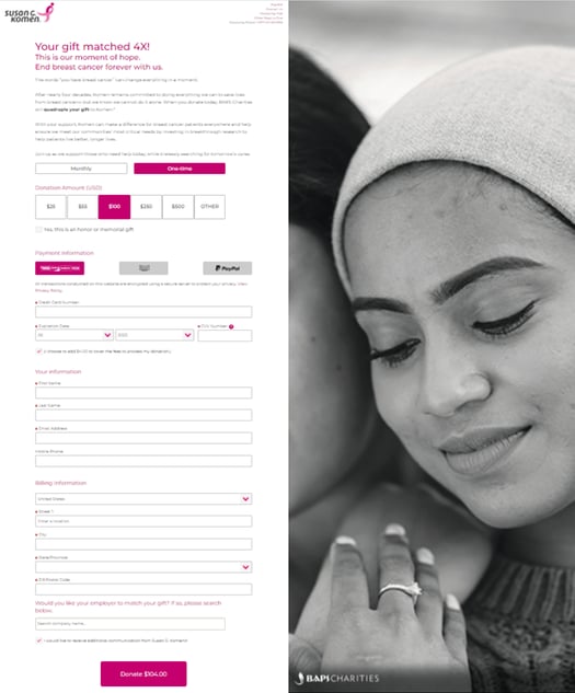
We’ve written before about the importance of connecting your digital data and implementing proper measurement. Susan G. Komen’s donation form shows exactly what nonprofits can do with this.
By following the data, they were able to understand where users were experiencing errors and inefficiencies. Optimizing the form then led to a 64% reduction in errors and an 8.1% lift in revenue.
Connected data also gives Komen the ability to create dynamic gift arrays that are personalized to each user.
7. American Bible Society
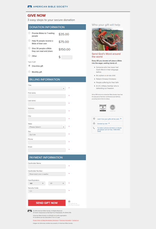
We love a cause that can display donation amounts in terms of impact. It creates a direct connection to what motivates the audience to donate. For the American Bible Society, it’s bibles, but this tactic is also great for food banks and animal shelters.
The form is practically asking, “How much of an impact do you want to make?” Donors are prompted to think about their donation in terms of bibles instead of dollars. Implemented correctly, copy like this could give a boost to your average donation amount.
Donate to American Bible Society
8. SPCA of Texas
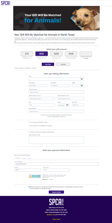
Ensuring that your donation page has modern payment options available is becoming more and more critical to driving donor conversions. People simply want to pay their preferred way, and nonprofits must meet them where they are.
SPCA of Texas does a great job here with multiple options, including credit card, PayPal and Venmo.
9. Food Bank of Central & Eastern North Carolina
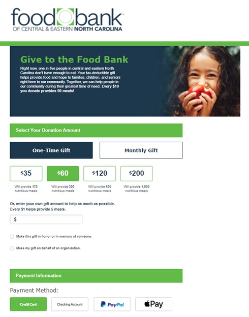
The Food Bank of Central & Eastern North Carolina also prioritizes modern payment options on their donation form. In addition to credit cards and PayPal, the food bank accepts ACH and Apple Pay.
Donate to Food Bank of Central & Eastern North Carolina
10. Fred Hutchinson Cancer Center
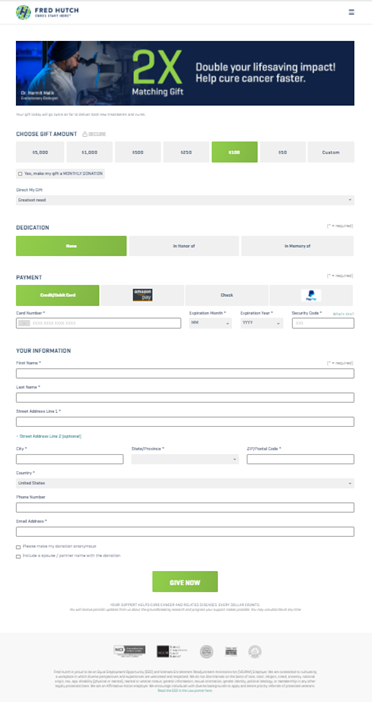
Fred Hutch really focuses on simplicity in its design. Every engagement tool on this page is large, colorful and easy to click, and the required fields sections are short.
This is how you build interaction and convenience for your donors. This page probably takes one minute to fill out, which is the aim. It’s hard to miss anything or feel confused about this page. No unnecessary information is needed to complete this transaction.
Donate to Fred Hutchinson Cancer Center
11. Three Square
Today’s marketing success often comes from data and the ability to understand your donors. These final two pages on our list bring some behind-the-scenes technology into their efforts that we’d like to highlight.
Three Square’s donation form features source code tracking so they know exactly where donors are coming from to reach the page—and which campaigns and channels are most effective. These UTM parameters also allow gift array management.
12. Food Bank for New York City
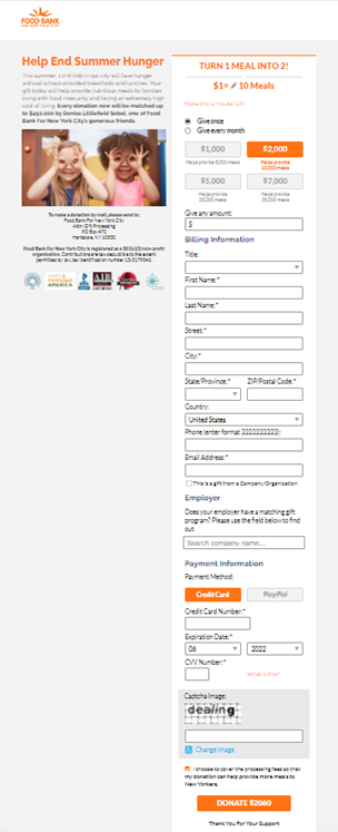
Food Bank for New York City also leverages UTM tracking to understand the acquisition medium and campaign for the page’s traffic. They’re even able to track offline users who make online visits. That means they can see when a particular gift came through a summer match campaign in direct mail, for example.
As an added bonus, FBNYC features a vanity URL that points to their donation form: foodbanknyc.org/meals22
Donate to Food Bank for New York City





Leave a comment: